Vibecoded a Chrome Plugin for Design Quality Assurance cutting QA time by 40%

Vibecoded a Chrome Plugin for Design Quality Assurance cutting QA time by 40%

Vibecoding

Cursor, Claude

Shipped

Role

Role

Designer & Builder-

solo, end-to-end

Duration

Duration

3 days

Stack

Stack

Cursor, Claude, Vercel, JSON

Cursor, Claude, Vercel, JSON

Team

Team

Solo Product Designers

Solo Product Designers

Here’s a 1 min TL;DR version

Here’s a 1 min TL;DR version

THE PROBLEM

Design QA requires screenshotting bugs into PowerPoints and recording Looms just to tell developers what's broken. It's a lot of effort!

MY VIBECODING PROCESS

MY VIBECODING PROCESS

1

1

Found the problem

Found the problem

Spotted the problem at work but couldn't find a free & efficient tool

Spotted the problem at work but couldn't find a free & efficient tool

2

2

Quick Research

Quick Research

Found Reddit and LinkedIn posts of designers frustrated with the same workflow

Found Reddit and LinkedIn posts of designers frustrated with the same workflow

3

3

Vibecoding

Vibecoding

Started vibecoding with the most basic features I needed

Started vibecoding with the most basic features I needed

4

4

Iterations

Iterations

Iterated in Cursor & added complexity as the core worked

Iterated in Cursor & added complexity as the core worked

5

5

Repeat Process

Tested. Iterated. Built. Tested again.

Tested. Iterated. Built. Tested again.

6

6

Ship MVP

Shipped in 3 days and integrated it into my design workflow

Shipped in 3 days and integrated it into my design workflow

SOLUTION OVERVIEW

SOLUTION OVERVIEW

A free Chrome plugin for Design QA!

A free Chrome plugin for Design QA!

Annotate directly on the live site

Annotate directly on the live site

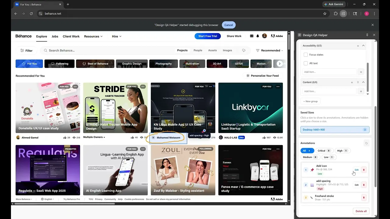
Switch viewports and create unique annotations

Check off a QA list

Check off a QA list

Export one JSON file

Export one JSON file

Export one JSON file anyone can load

Export one JSON file anyone can load

Let’s start from the beginning

THE PROBLEM EXPLAINED

THE PROBLEM EXPLAINED

Designers screenshot bugs into PowerPoints and record Looms just to tell developers what's broken. Hours wasted, context lost.

Designers screenshot bugs into PowerPoints and record Looms just to tell developers what's broken. Hours wasted, context lost.

Spot an issue on the live site. Screenshot it. Open PowerPoint. Paste it. Write a description. Do that 15 more times. Record a Loom so the developer understands the context. Send it. Wait.

MARKET RESEARCH

MARKET RESEARCH

I looked for a tool but every option either costs money or doesn't provide all the features I needed for QA

I looked for a tool but every option either costs money or doesn't provide all the features I needed for QA

Dedicated QA tools exist. Built for enterprise teams, they cost money and need onboarding. For a startup where the designer is also the QA team; not realistic.

QUICK ITERATIONS ON CURSOR

QUICK ITERATIONS ON CURSOR

I explored three directions: a screenshot tool, a form logger, a live overlay. Only one solved both sides of the problem.

I explored three directions: a screenshot tool, a form logger, a live overlay. Only one solved both sides of the problem.

Before opening Cursor, I mapped out the MVP and different approaches which I then quickly vibecoded to test and see which answered the same question: does it keep context for the designer AND give the developer something structured?

Every major screen size like, 1280, 1440, 1920px is divisible by 8. Using 8-based spacing means components scale cleanly across breakpoints without half-pixel rendering artifacts.

For tight component internals where 8px is too large, multiples of 4 act as a sub-grid, keeping the system intact without sacrificing density in data-heavy fintech UIs.

KEY DESIGN DECISION

KEY DESIGN DECISION

I explored three directions: a screenshot tool, a form logger, a live overlay. Only one solved both sides of the problem.

I explored three directions: a screenshot tool, a form logger, a live overlay. Only one solved both sides of the problem.

Before opening Cursor, I mapped out the MVP and different approaches which I then quickly vibecoded to test and see which answered the same question: does it keep context for the designer AND give the developer something structured?

Every major screen size like, 1280, 1440, 1920px is divisible by 8. Using 8-based spacing means components scale cleanly across breakpoints without half-pixel rendering artifacts.

For tight component internals where 8px is too large, multiples of 4 act as a sub-grid, keeping the system intact without sacrificing density in data-heavy fintech UIs.

Every major screen size like, 1280, 1440, 1920px is divisible by 8. Using 8-based spacing means components scale cleanly across breakpoints without half-pixel rendering artifacts.

For tight component internals where 8px is too large, multiples of 4 act as a sub-grid, keeping the system intact without sacrificing density in data-heavy fintech UIs.

THE SOLUTION

THE SOLUTION

I explored three directions: a screenshot tool, a form logger, a live overlay. Only one solved both sides of the problem.

I explored three directions: a screenshot tool, a form logger, a live overlay. Only one solved both sides of the problem.

Before opening Cursor, I mapped out the MVP and different approaches which I then quickly vibecoded to test and see which answered the same question: does it keep context for the designer AND give the developer something structured?

Every major screen size like, 1280, 1440, 1920px is divisible by 8. Using 8-based spacing means components scale cleanly across breakpoints without half-pixel rendering artifacts.

For tight component internals where 8px is too large, multiples of 4 act as a sub-grid, keeping the system intact without sacrificing density in data-heavy fintech UIs.

Every major screen size like, 1280, 1440, 1920px is divisible by 8. Using 8-based spacing means components scale cleanly across breakpoints without half-pixel rendering artifacts.

For tight component internals where 8px is too large, multiples of 4 act as a sub-grid, keeping the system intact without sacrificing density in data-heavy fintech UIs.

IMPACT

IMPACT

I explored three directions: a screenshot tool, a form logger, a live overlay. Only one solved both sides of the problem.

I explored three directions: a screenshot tool, a form logger, a live overlay. Only one solved both sides of the problem.

Before opening Cursor, I mapped out the MVP and different approaches which I then quickly vibecoded to test and see which answered the same question: does it keep context for the designer AND give the developer something structured?

Every major screen size like, 1280, 1440, 1920px is divisible by 8. Using 8-based spacing means components scale cleanly across breakpoints without half-pixel rendering artifacts.

For tight component internals where 8px is too large, multiples of 4 act as a sub-grid, keeping the system intact without sacrificing density in data-heavy fintech UIs.

Every major screen size like, 1280, 1440, 1920px is divisible by 8. Using 8-based spacing means components scale cleanly across breakpoints without half-pixel rendering artifacts.

For tight component internals where 8px is too large, multiples of 4 act as a sub-grid, keeping the system intact without sacrificing density in data-heavy fintech UIs.

Problem spotted Friday. Shipped Monday. Here's what 3 days taught me.

LEARNINGS

LEARNINGS

Problem spotted Friday. Shipped Monday. Here's what 3 days taught me.

Problem spotted Friday. Shipped Monday. Here's what 3 days taught me.

Before opening Cursor, I mapped out the MVP and different approaches which I then quickly vibecoded to test and see which answered the same question: does it keep context for the designer AND give the developer something structured?

Every major screen size like, 1280, 1440, 1920px is divisible by 8. Using 8-based spacing means components scale cleanly across breakpoints without half-pixel rendering artifacts.

For tight component internals where 8px is too large, multiples of 4 act as a sub-grid, keeping the system intact without sacrificing density in data-heavy fintech UIs.

Every major screen size like, 1280, 1440, 1920px is divisible by 8. Using 8-based spacing means components scale cleanly across breakpoints without half-pixel rendering artifacts.

For tight component internals where 8px is too large, multiples of 4 act as a sub-grid, keeping the system intact without sacrificing density in data-heavy fintech UIs.

Problem spotted Friday. Shipped Monday. Here's what 3 days taught me.