

Built 50+ components for OptionsPlay first design system cutting feature rollout time by 45%
Built 50+ components for OptionsPlay first design system cutting feature rollout time by 45%
Design System
Scalable
Shipped


Role
Role
Product Designer, Contract
Product Designer, Contract
Solo designer owning the full project: audit → figma component library → variables → AI-assisted developer handoff
Solo designer owning the full project: audit → figma component library → variables → AI-assisted developer handoff
Duration
Duration
2 week sprint (Feb 2026)
2 week sprint (Feb 2026)
Stack
Stack
Figma, Claude, Vercel
Figma, Claude, Vercel
Team
Team
2 Product Designers
2 Product Designers
8 Developers
8 Developers
1 PM, CTO
1 PM, CTO
Here’s a 1 min TL;DR version
Here’s a 1 min TL;DR version
THE PROBLEM
THE PROBLEM
12 years of product. Zero shared library.
12 years of product. Zero shared library.
The Options Trading Platform has been in market for 12 years but design decisions are living entirely in people's heads. No tokens, no documentation, no source of truth. The same component looked different on three screens.
The Options Trading Platform has been in market for 12 years but design decisions are living entirely in people's heads. No tokens, no documentation, no source of truth. The same component looked different on three screens.
Three core problems:
Three core problems:
Inconsistent UI
Inconsistent UI
Scalability Risks
Scalability Risks
Increased time for feature roll-out
Increased time for feature roll-out
SOLUTION OVERVIEW
SOLUTION OVERVIEW
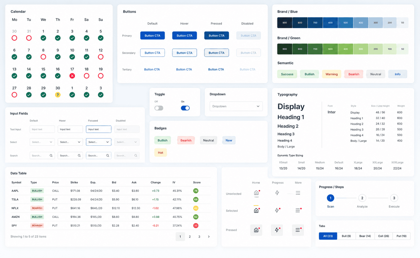
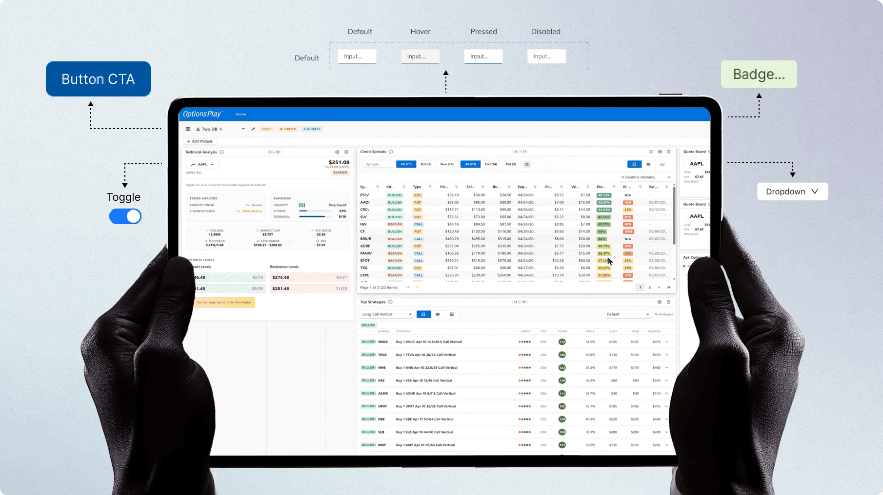
Design system with 50+ components and more!
Design system with 50+ components and more!

Let’s start from the beginning
GOALS OF THE SPRINT
GOALS OF THE SPRINT
Build a system that scales for both teams.
Build a system that scales for both teams.
Business Goals
Cut feature roll-out time across engineering
Cut feature roll-out time across engineering
Reduce design-to-dev friction and handoff
Reduce design-to-dev friction and handoff
Support team scaling without quality loss
Support team scaling without quality loss
Design Goals
Build a token-based Figma variable foundation
Build a token-based Figma variable foundation
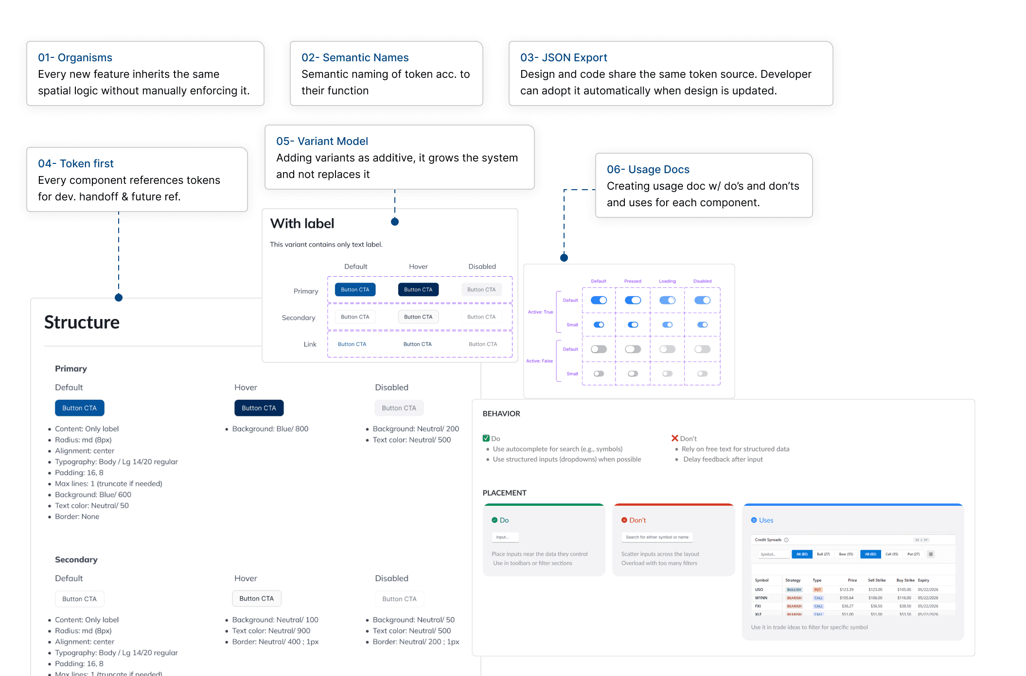
Document every component with usage guidelines
Document every component with usage guidelines
Establish organism patterns for dashboards & widgets
Establish organism patterns for dashboards & widgets
Generate AI-assisted developer handoff with Claude
Generate AI-assisted developer handoff with Claude
DESIGN SYSTEM BASICS
DESIGN SYSTEM BASICS
Building out of Tokens
Building out of Tokens
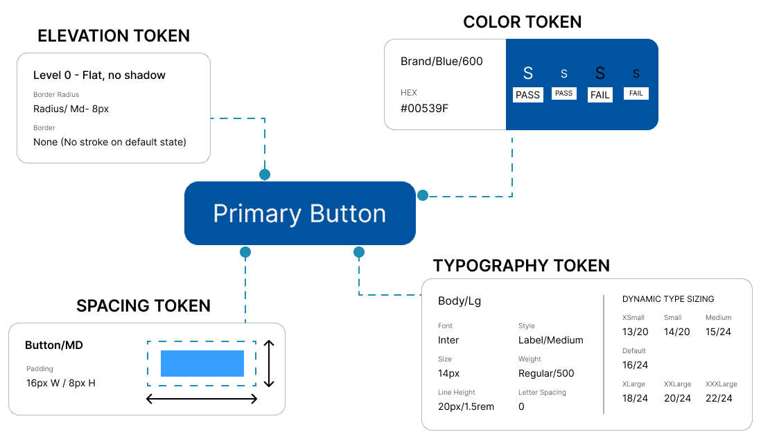
The token is the smallest pieces in the design system. They represents a design property or characteristic, such as color, typography, spacing, or shadow.
Tokens are used to maintain consistency and streamline the design and development process within a design system. Every component in the design system is built out of various tokens. In our design system, we call tokens Foundation.
SPACING SYSTEM
SPACING SYSTEM
Using 8 Grid System
Using 8 Grid System

Every major screen size like, 1280, 1440, 1920px is divisible by 8. Using 8-based spacing means components scale cleanly across breakpoints without half-pixel rendering artifacts.
For tight component internals where 8px is too large, multiples of 4 act as a sub-grid, keeping the system intact without sacrificing density in data-heavy fintech UIs.
MY APPROACH
MY APPROACH
Five phases, one system
Five phases, one system
01 Audit
02 Foundation
03 Components
04 Structure
05 Handoff
Phase 1 - Audit
Before designing anything new, I went through every existing screen to extract what was actually there. The goal wasn't to judge- it was to find the real patterns underneath years of additions.
Catalogued all unique button styles, input types, and card variants
Reduce design-to-dev friction and handoff
Support team scaling without quality loss
SCALABILITY
SCALABILITY
Making sure the Design System is scalable
Making sure the Design System is scalable
Every decision was weighted against one question: what happens when OptionsPlay doubles its team in a year?
Every decision was weighted against one question: what happens when OptionsPlay doubles its team in a year?
ACCESSIBILITY
ACCESSIBILITY
Checking WCAG 2.1 AA standards in every component
Checking WCAG 2.1 AA standards in every component
I baked in accessibility audit while creating the components and embedded it in every token decision from the start. For a fintech product with a broad user demographic, this was a non-negotiable.
I baked in accessibility audit while creating the components and embedded it in every token decision from the start. For a fintech product with a broad user demographic, this was a non-negotiable.
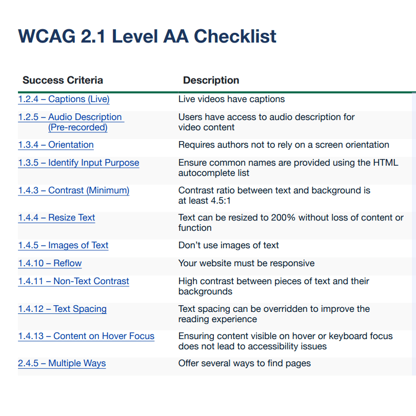
What was reviewed:
What was reviewed:
All color token pairs tested for contrast ratio
All color token pairs tested for contrast ratio
Focus states defined for every interactive component
Focus states defined for every interactive component
Error states use icon + text, never color alone
Error states use icon + text, never color alone
Minimum 44×44px tap targets on all interactive elements
Minimum 44×44px tap targets on all interactive elements
Screen reader annotations documented per component
Screen reader annotations documented per component
AI INTEGRATION
AI INTEGRATION
Integration with MCP
Integration with MCP
I baked in accessibility audit while creating the components and embedded it in every token decision from the start. For a fintech product with a broad user demographic, this was a non-negotiable.
I baked in accessibility audit while creating the components and embedded it in every token decision from the start. For a fintech product with a broad user demographic, this was a non-negotiable.
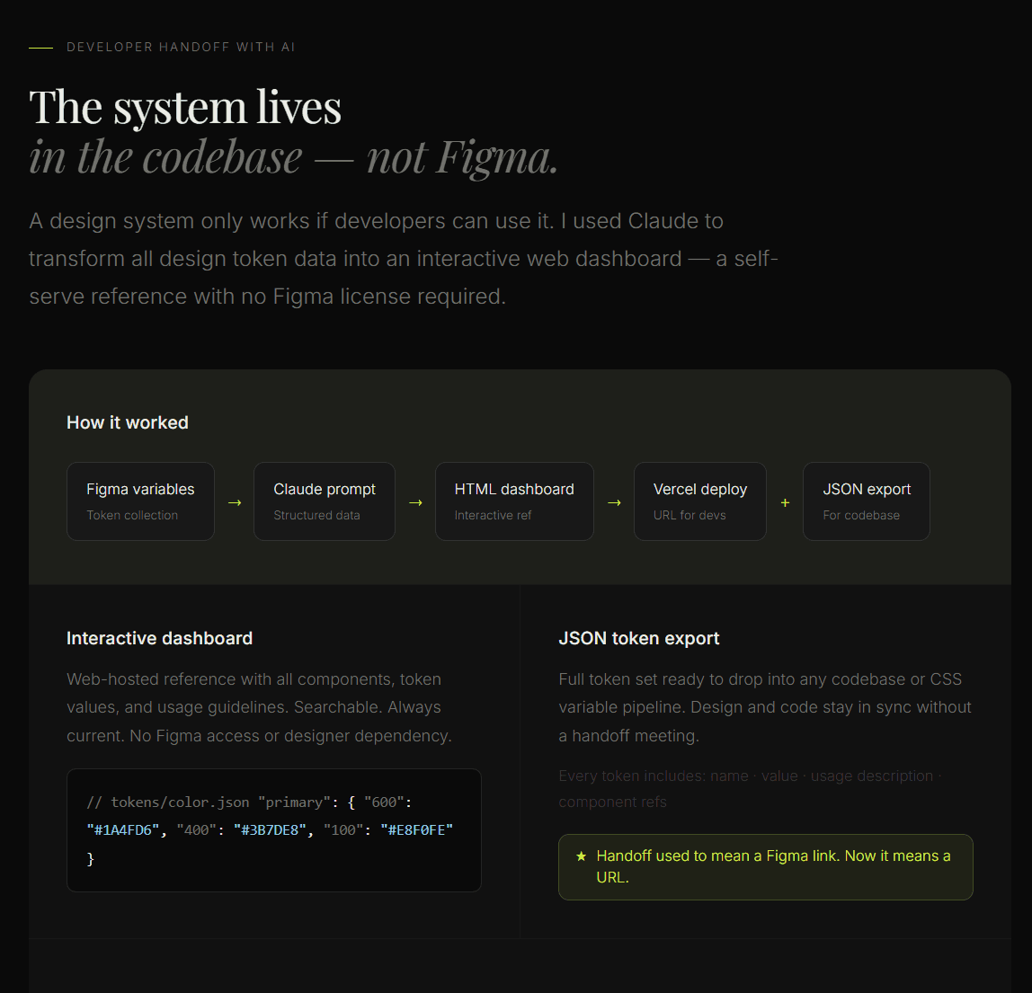
IMPACT
IMPACT
Integration with MCP
Integration with MCP
50+
Components
80%
Reduced design → dev handoff time
<1 hour
to create new components with integration with MCP
Sreesha Suresh
