


Project 1
Designed a new webpage for AB InBev India’s site to showcase the Global Capability Center (GAC) India, highlighting its impact, and global contributions.
Project 2
Learning & Development Website
Created an internal website to help employees easily find upskilling resources, tools, and programs. It serves as a central hub for learning information.
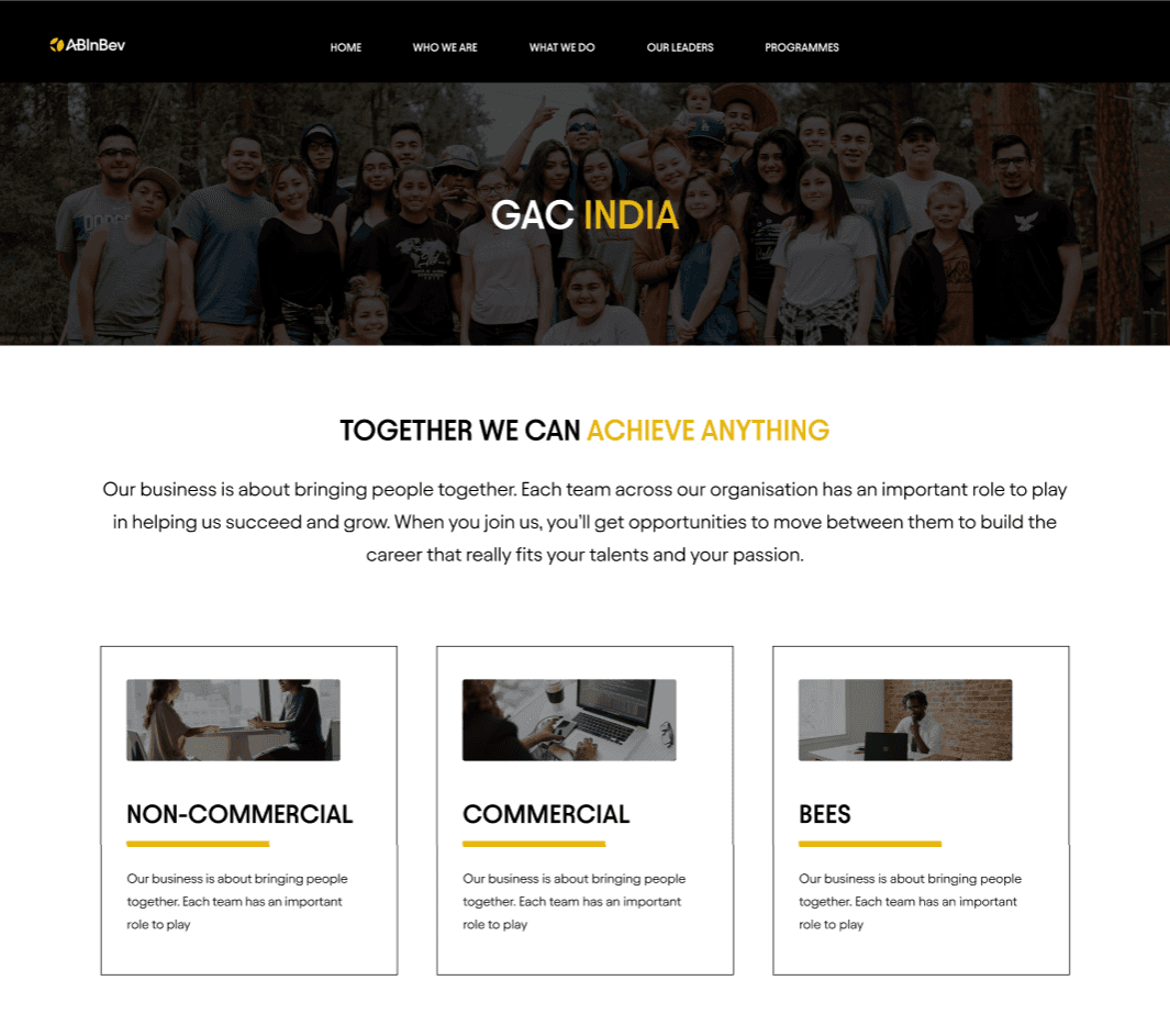
GAC India Page
WHAT WAS THE SCENARIO?
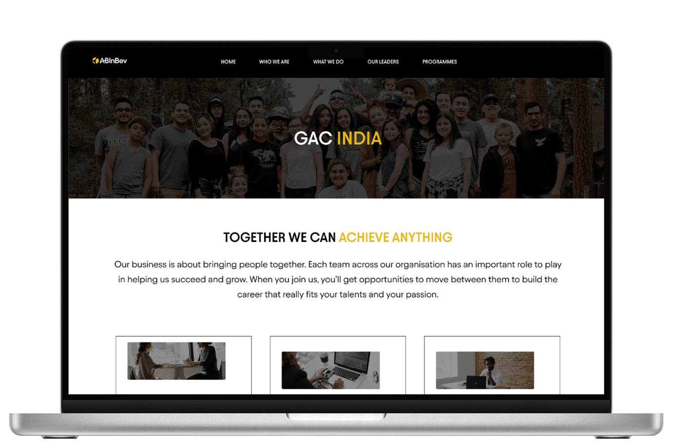
One of my first projects at AB InBev was to design a webpage for their Global Capability Center (GAC) to be included in the What we do section of the AB InBev India website. At the time, there was no digital presence for GAC on the company website, and the brief was pretty open-ended
“We want a page that captures who we are and what we do.”
It was exciting, but also a little overwhelming — there was a lot to figure out.
Figuring out the Structure
How did I approach the brief?
To get started, I ran a short internal survey (12 people responded) and spoke to a few stakeholders from the GAC team to understand what mattered most.
What did the users want?
Finding 1
highlight their different teams (commercial, non-commercial, etc)
Finding 2
showcase awards like the NASSCOM GCC win
Finding 3
give people a sense of the culture
WHat else did I do?
I did some light SEO research using SEMrush and Google Search to look at what kinds of phrases people were using to search for similar pages
“capability center Bangalore”
“AB InBev tech careers.”

Structuring the Story
Creating the information Architecture
GAC's Mission and Impact
Team Overviews
Awards & Recognition
Company Culture and Events
Careers & Call-to-Action
This structure was shared and approved after a quick collaborative session with the content and brand teams.
Next steps
Exploring layouts using with wireframes
Next, I developed two low-fidelity wireframes to explore different layout approaches — one with a modular grid, and another using a more narrative scroll-based layout. After a design critique with the internal design team, we opted for the modular approach to better support frequent updates and future scalability.
Low Fidelity Wireframes
Versions of landing page Tested with 10 users
Version 1

Version 2
Why did we choose version 2?
Progressive Disclosure & Visual Hierarchy
This layout follows a top-down visual hierarchy, easing users into deeper layers of content in a structured, digestible way.


the landscape
THE IMPACT I MADE WITH MY DESIGNS
32%
Project 1
GAC India Page
Designed a new webpage for AB InBev India’s site to showcase the Global Capability Center (GAC) India, highlighting its impact, and global contributions.
Project 2
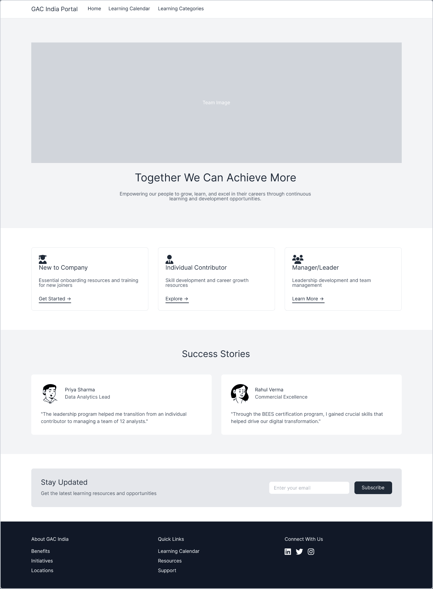
Learning & Development Website
Created an internal website to help employees easily find upskilling resources, tools, and programs. It serves as a central hub for learning information.
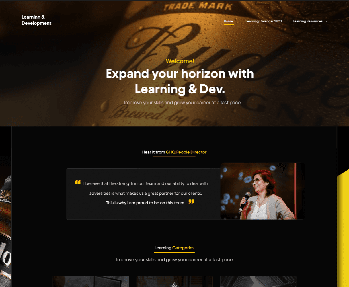
Learning & Development Website
WHAT WAS THE SCENARIO?
The Learning & Development (L&D) team at AB InBev India needed a centralized website where employees across all levels—new hires to senior managers—could easily discover learning resources, growth pathways, and skill development programs.
“We need a platform that helps employees find what’s relevant to them, based on where they are in their journey”
My Role
A summary of my role
As the UX Designer on this cross-functional team, I collaborated closely with a UX Researcher and developers throughout the end-to-end process. My responsibilities included:
Conducting competitive analysis of top internal learning tools
Pitching layout and content ideas with references from modern learning platforms
Collaborating with the L&D team to evolve their initial outline into a richer, more user-friendly content plan
Leading design discussions and iterating through stakeholder feedback
Mapping out the user flow and structuring a detailed information architecture
Creating low-fidelity wireframes for design exploration
Delivering high-fidelity UI aligned with AB InBev’s brand and development constraints
Figuring out the Structure
The Challenge
01
02
Discovery & Research
How did I approach the brief?
Analyzed the internal structure of existing L&D tools
Identified patterns in how employees access learning material
I reviewed 5+ comparable learning platforms
Highlighted features that streamlined user experience or enhanced content discovery
Defining Structure
Using the outline by the L&D team, I identified gaps
Pitched additional modules—such as role-based learning tracks, spotlight stories, and curated resources for leadership growth
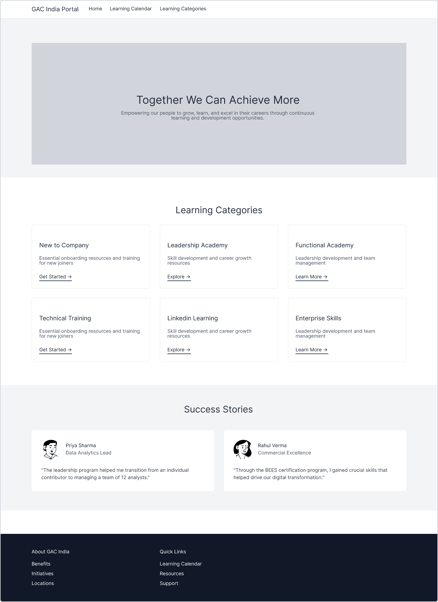
After back and forth with the stakeholder, we agreed upon a user centered structure, categorizing the content into three core audiences:
New to Company
Individual Contributors
Managers & Leaders
User Flow
Mapping out the golden path

Low Fidelity Wireframes
Versions of landing page Tested with 5 employees
Version 1
Version 2
Design Decision
Why did we Move forward with version 2?
Clarity through Categorization
All six learning categories are visible at once, making content easier to browse. This reduces cognitive load
Scannable Grid Improves Discoverability
A two-row layout improves visual scanning and quick access
Inclusive for All Users
Supports both new joiners and experienced employees offering self-service exploration without needing to identify
Better Content Hierarchy
The layout maintains a strong content hierarchy, starting with an inspirational message and immediately followed by actionable categories
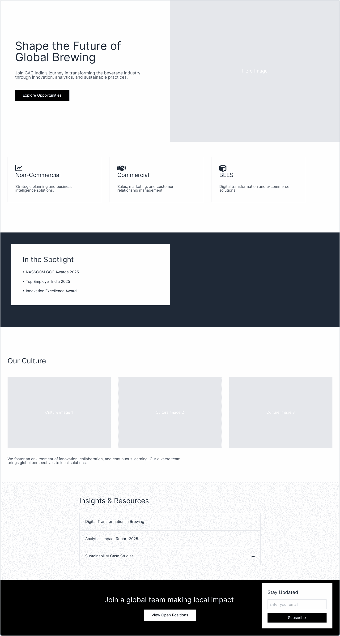
High Fidelity Designs

Landing Page

New to company page

Leadership Academy page

impact
Design is negotiation. The final product is rarely your first idea. It’s the result of asking better questions, listening carefully, and adapting with purpose.
Structure matters as much as style. A clean UI means nothing if users can’t find what they’re looking for
Collaboration shapes better outcomes – Frequent check-ins with the L&D team, researcher, and devs helped refine both scope and usability
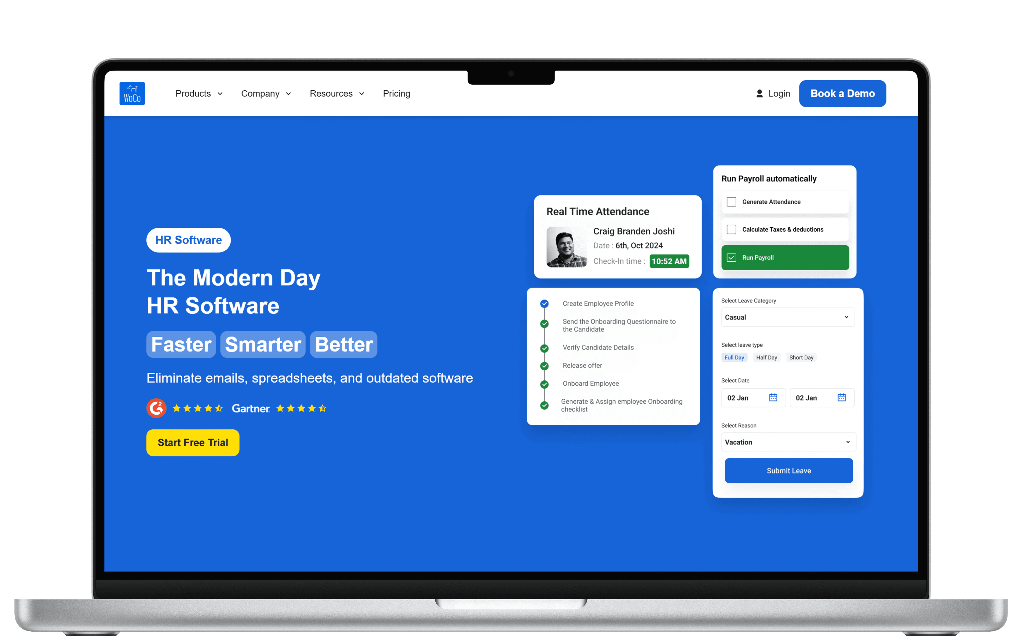
Work Companion LLP landing page
